

 Brazil has been changing into a country in which the LGBT community is becoming vilified. In a world that skin color and sexual orientation are constantly under attack, we created a theme that shows that everybody is equal and deserves
to have fun.
Brazil has been changing into a country in which the LGBT community is becoming vilified. In a world that skin color and sexual orientation are constantly under attack, we created a theme that shows that everybody is equal and deserves
to have fun. Equality and Diversity were the theme of the 12° Jivago Anniversary. With all its historical meaning, the LGBT Flag was defined as our inspiration for the presentation of the concept.
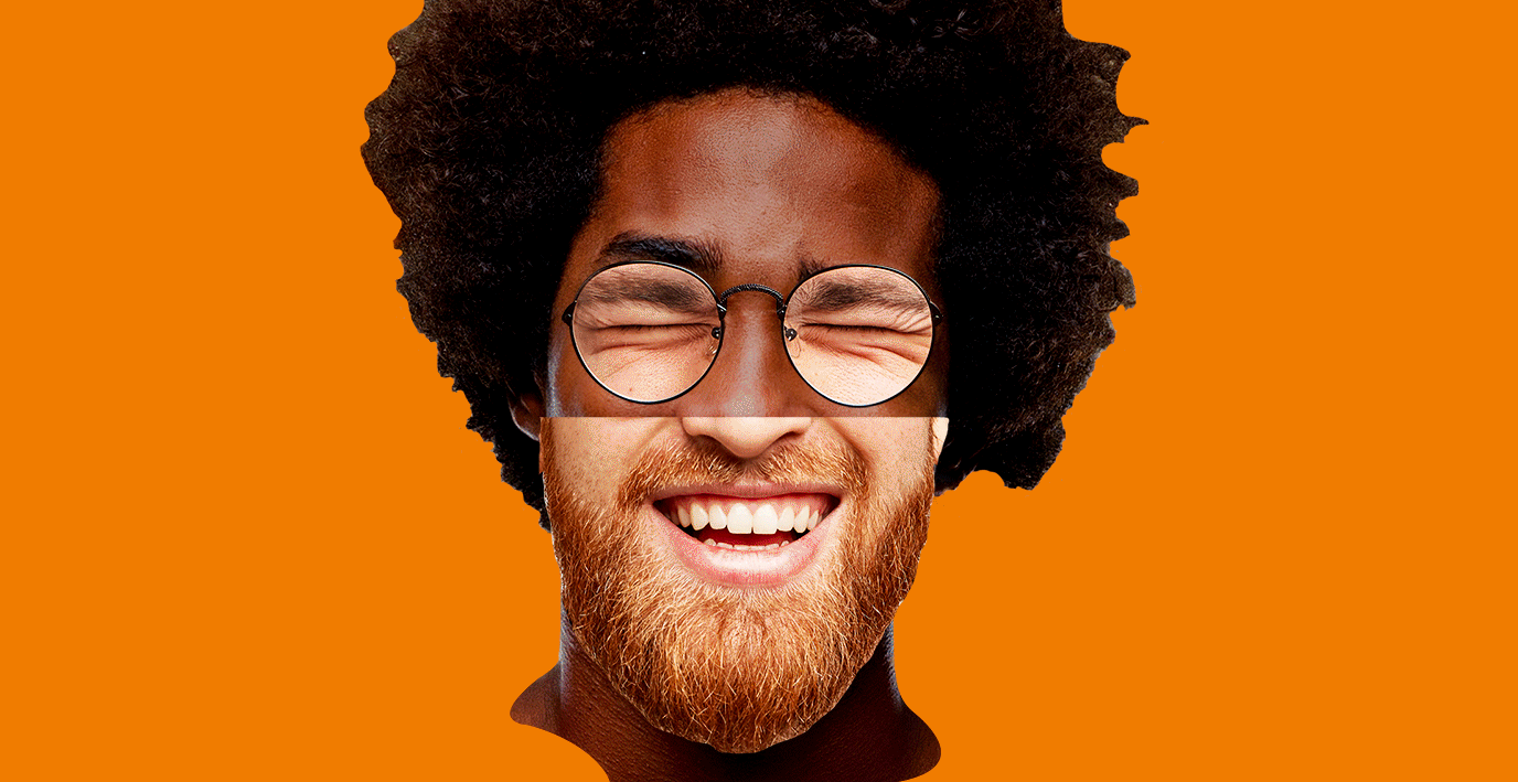
 A color was given to each letter to create the concept of amplification forwarding the idea that everyone belongs to the club. With that, we created an emotional and living brand that expands human rights, music and happiness.
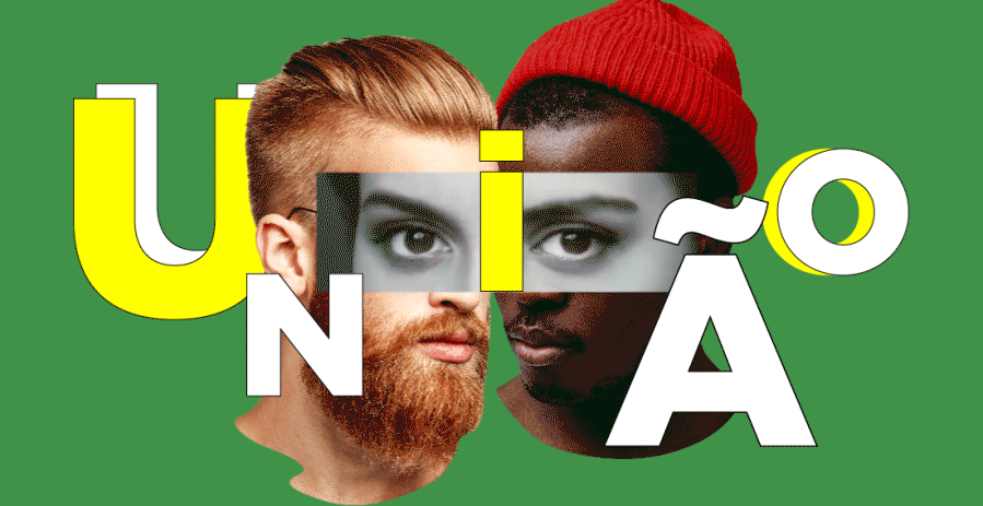

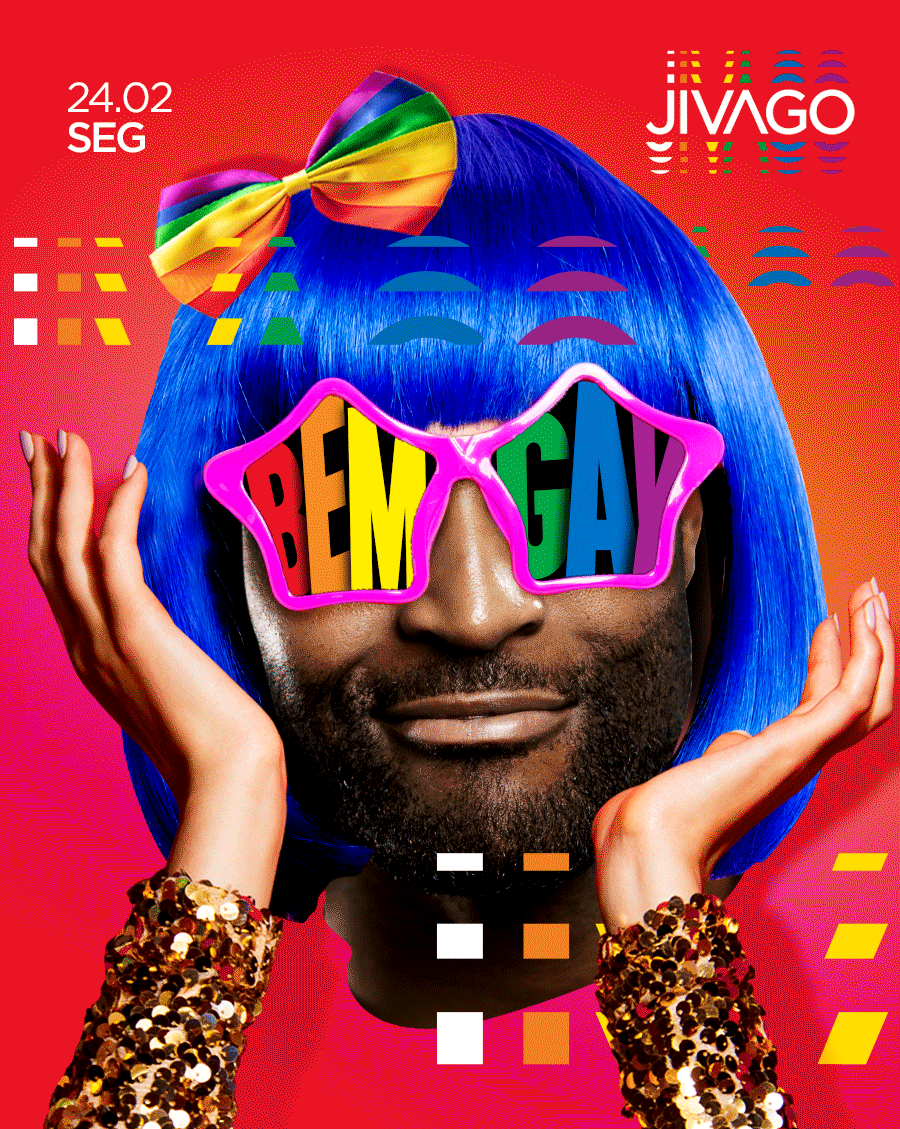
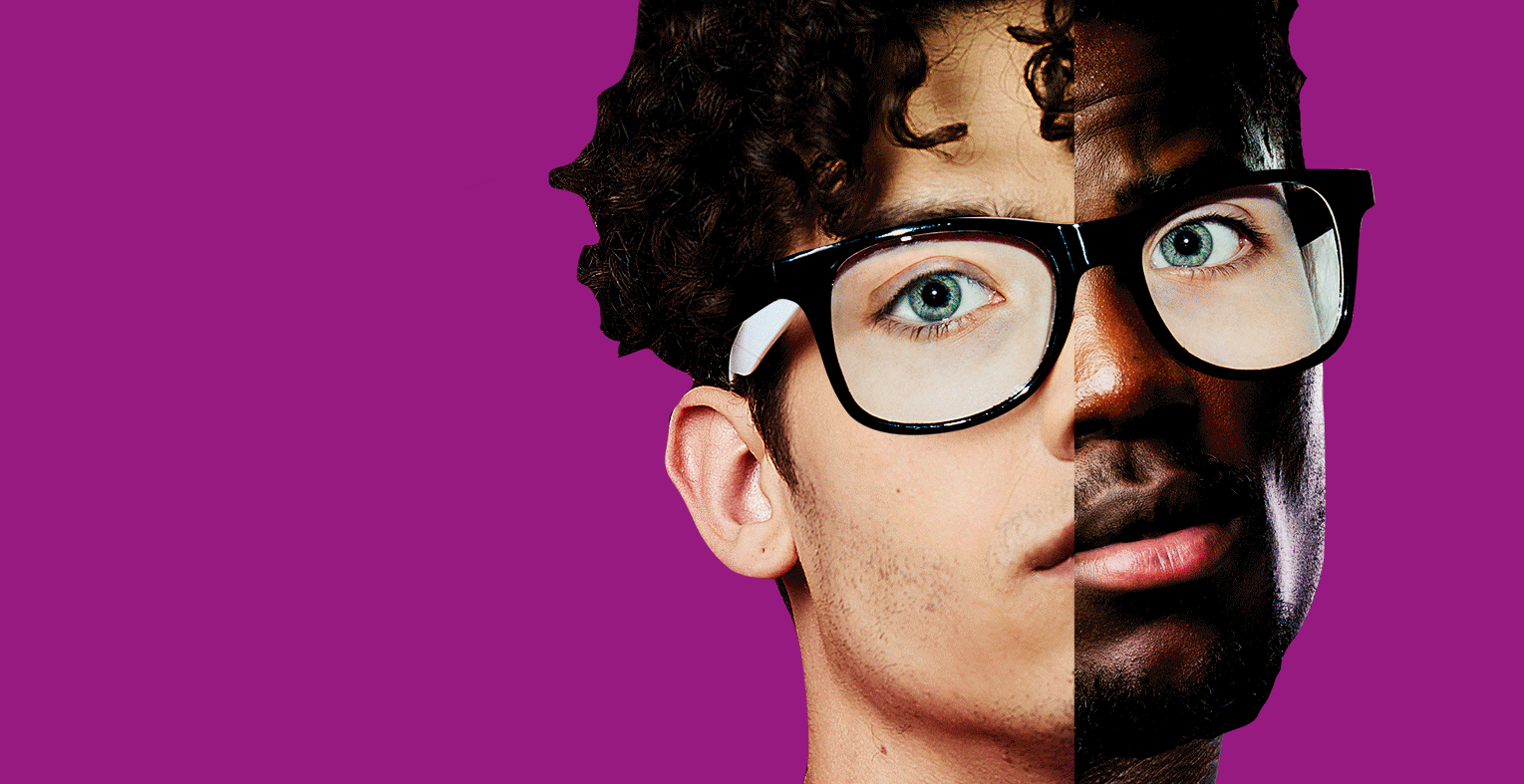 The six colors that compose the LGBT Flag served us as a base to guide each illustration pillar created for the campaign: Transformation, Diversity, Equality, Union, rEVOLution and Pride.
Vibrant colors create beautiful contrasts with the visual treatment given to the images. To represent each pillar word, a different combination was thought to combine multiple races into one.
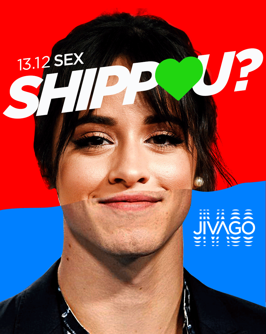
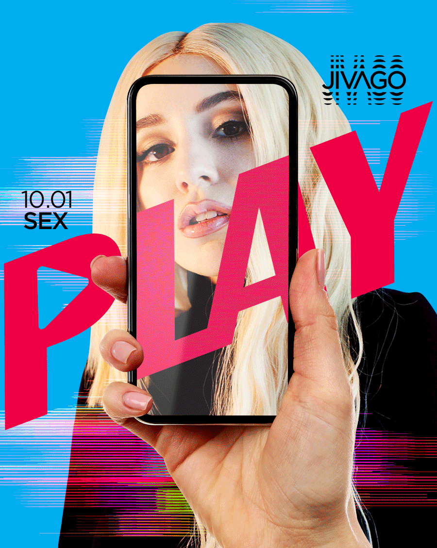
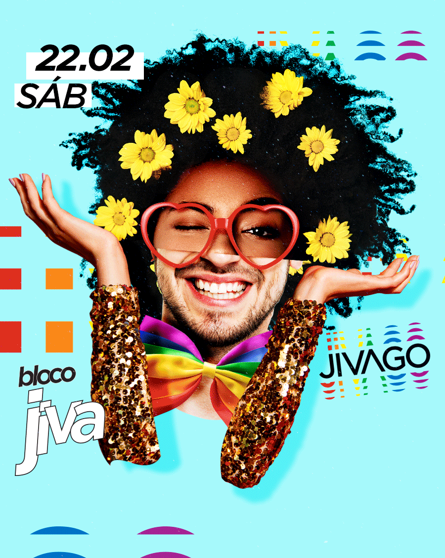
 Huge posters are glued all over the club, creating with them instagrammable points where the public can choose the one that fits their personality.
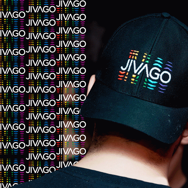
 The typography was developed in a way that reinforces the concept of the campaign. With the letters very close to the other and written in different font styles, we created with it, a strong graphic way to represent all the equality/union concept.
 The language created for the anniversary took us to some happy, strong and colorful layouts for the most important event of the year to the club: The Carnival.

 Combined with the new brand, the icons changed into beautiful and modern confetti that were used to create various effects for the Carnival Language.
 The result was some cool and inclusive layouts that united all races for this important event for all.
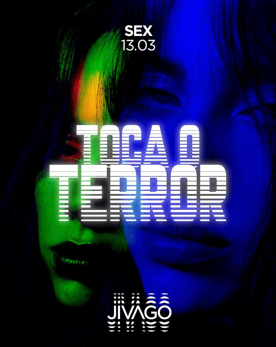
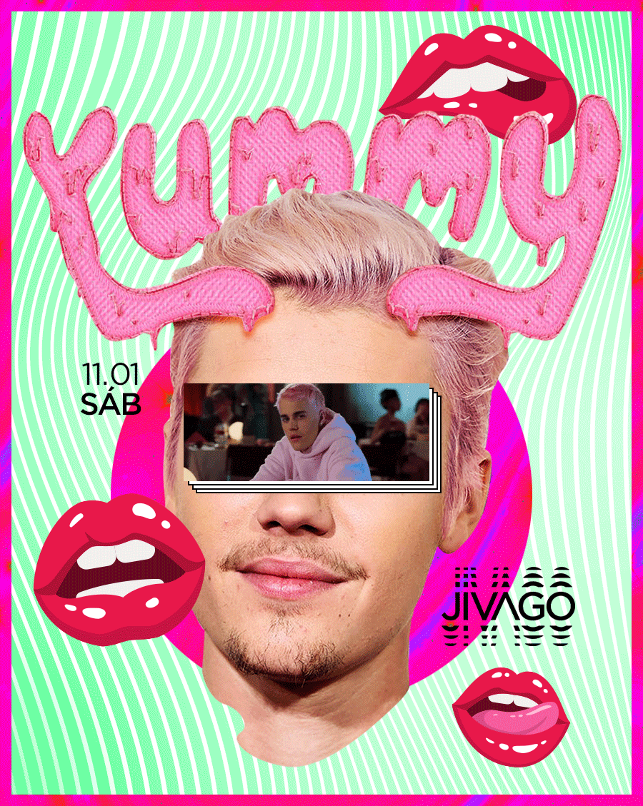
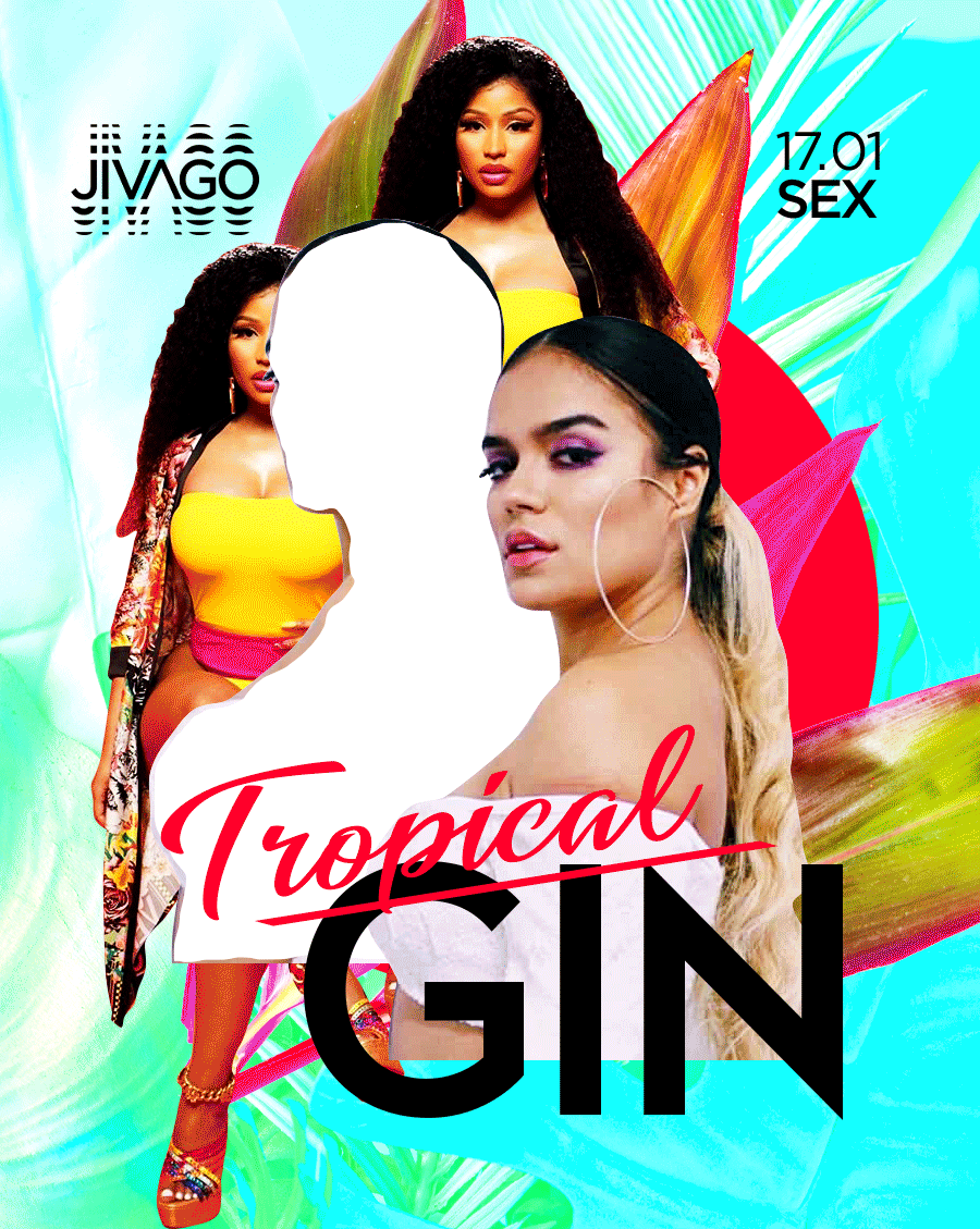
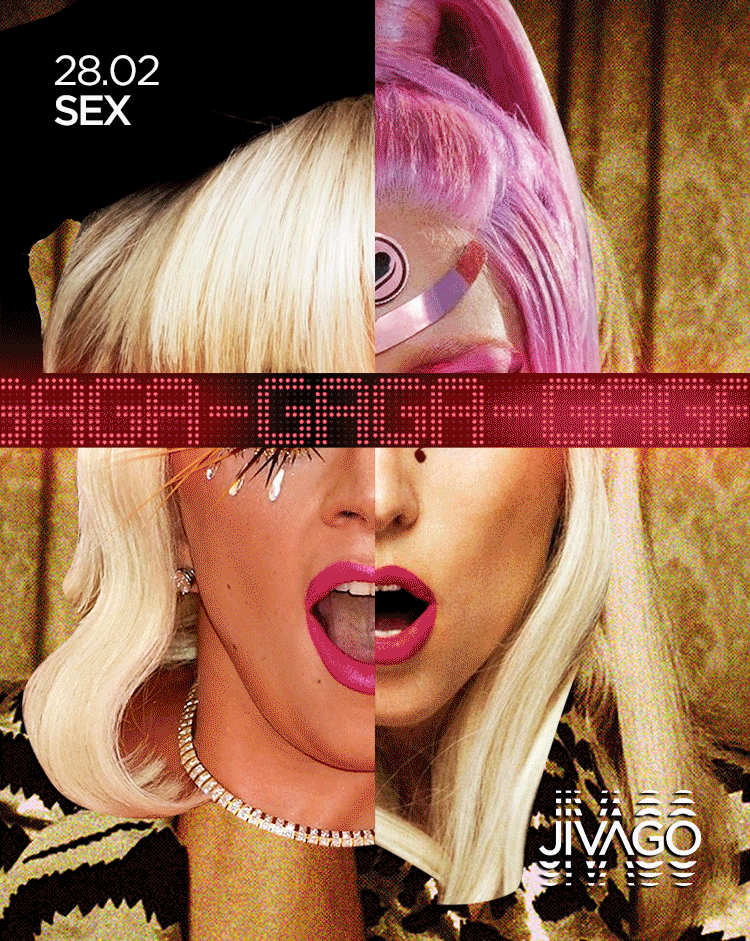
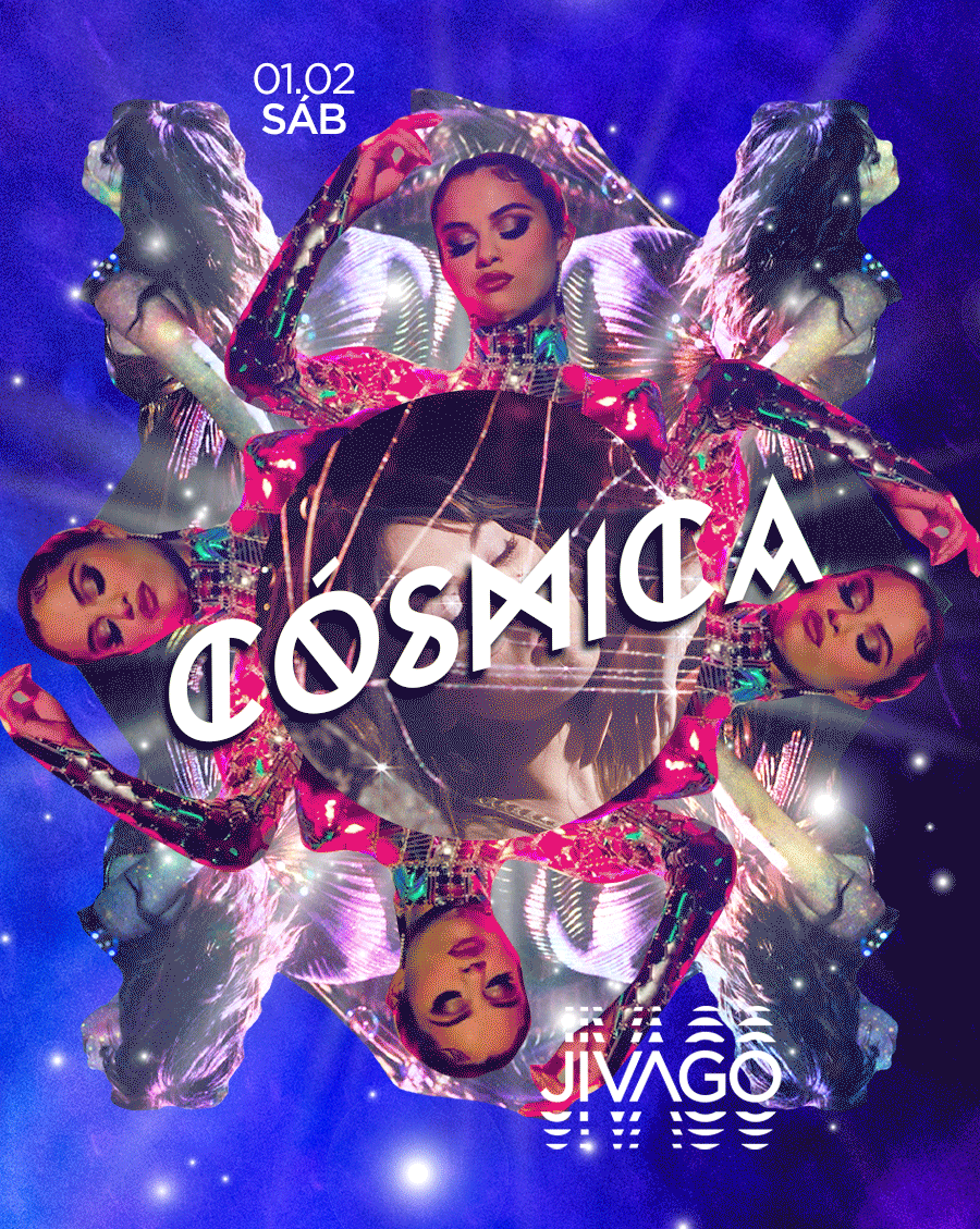
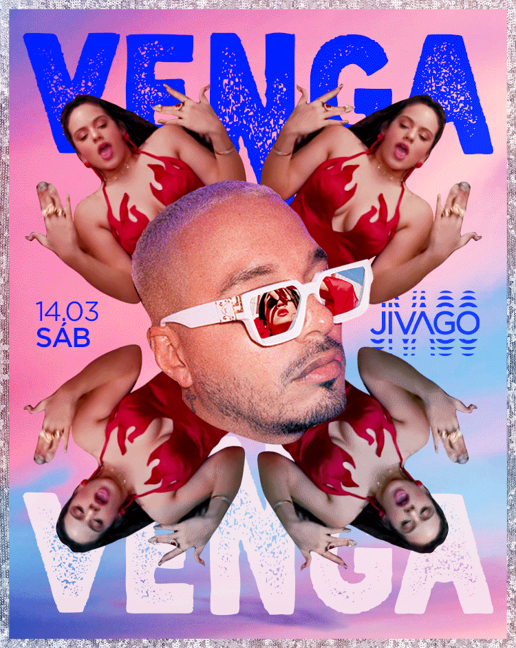
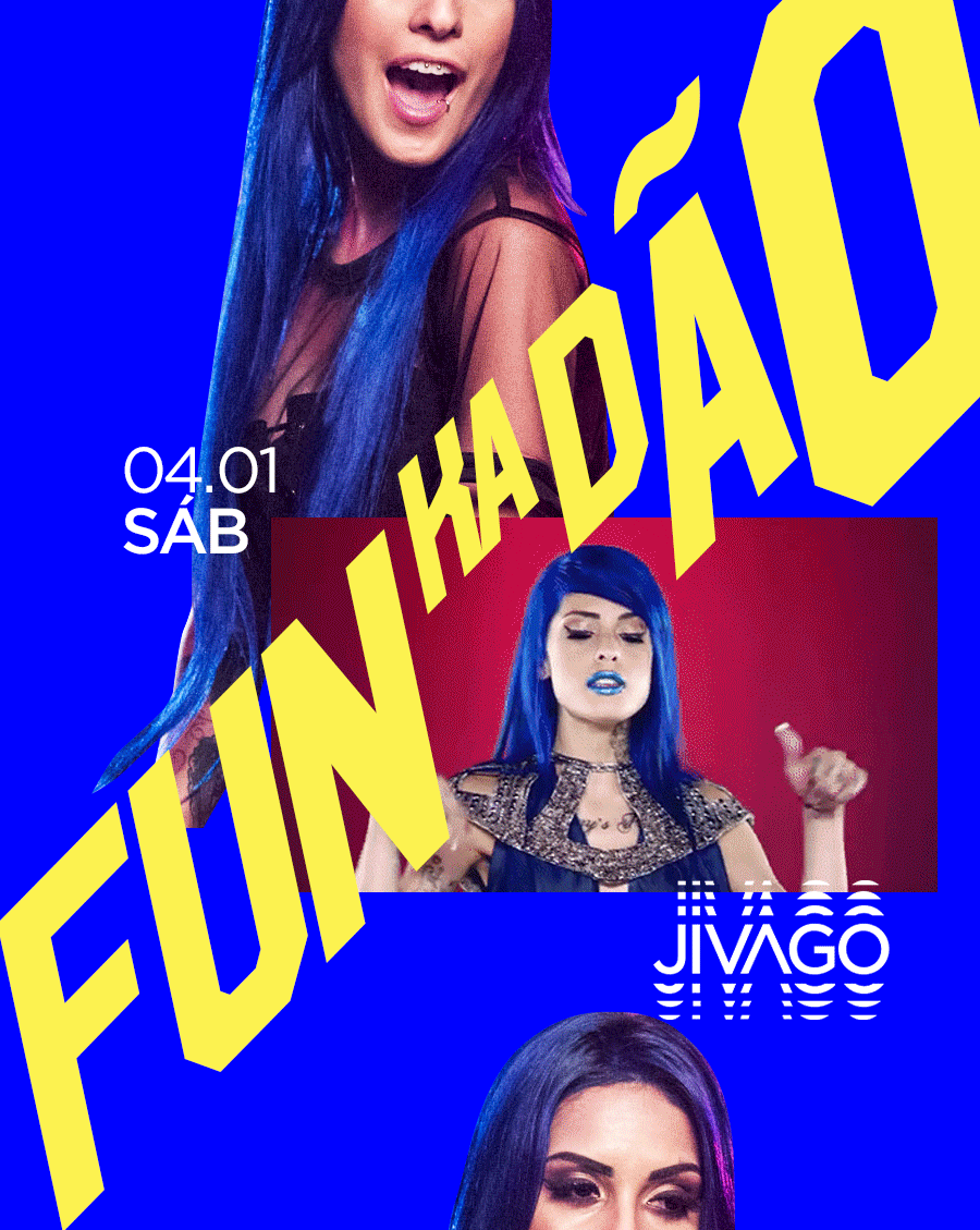
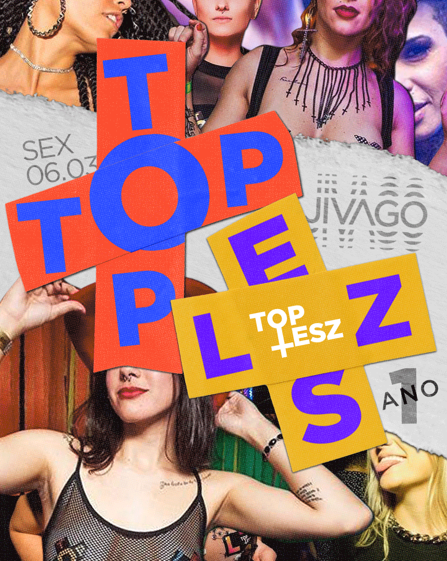
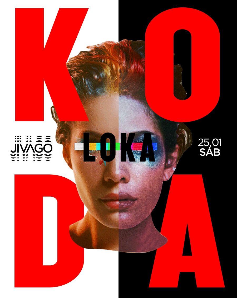
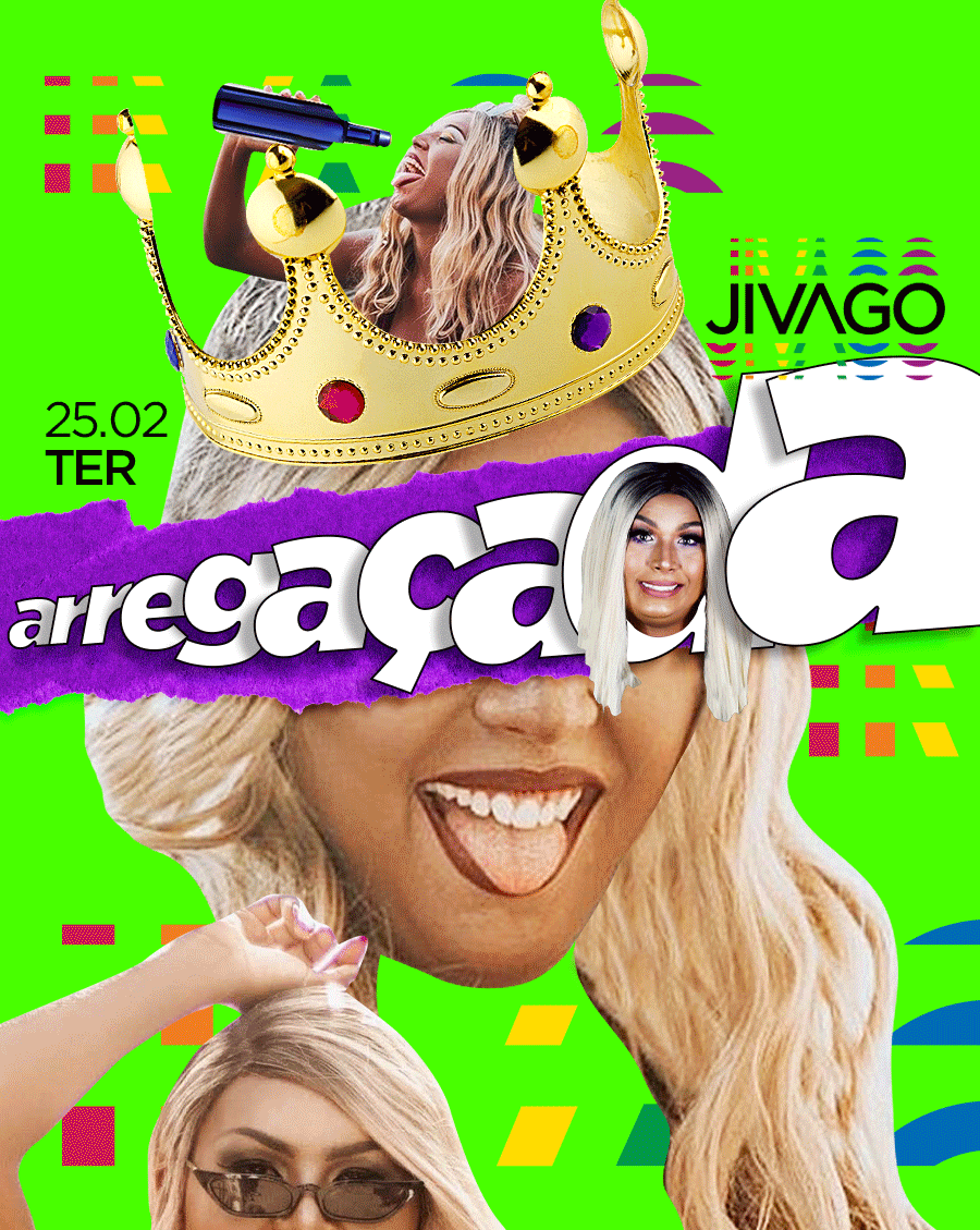
 The same visual assets were used to create the parties along the year.