


 ABSURDITY ABSURD. Born in the Netherlands, Skinny Whale is the new Craft Hard Seltzer which dares people to be different and to embrace absurdity in everything it does.
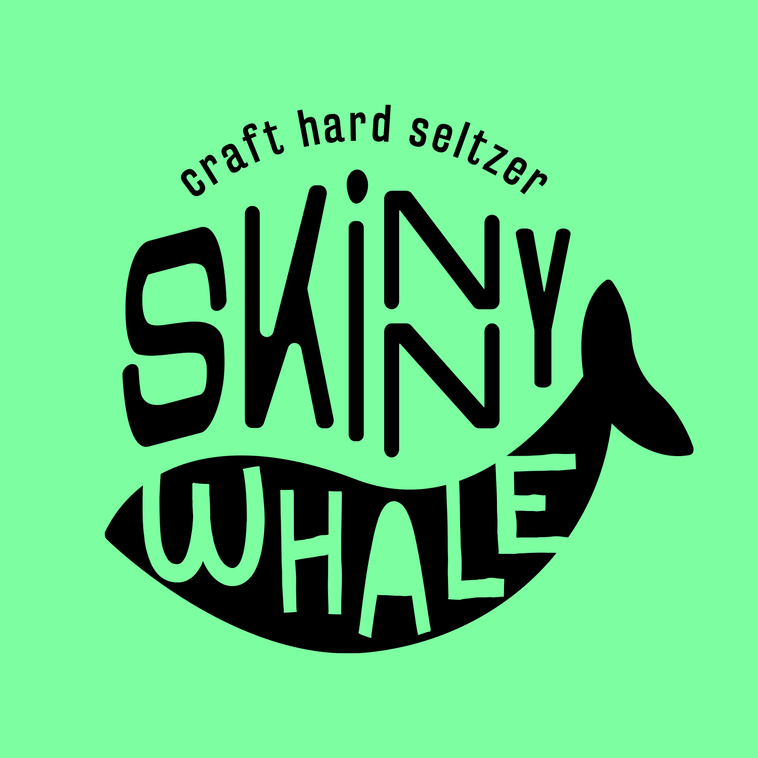
Going GenZ means leaving behind the basic rules of design. A mash up of colours, typography, styles and icons creates the image of a brand that’s not bound by too many rules.
An unusual typography and structure leads the layout, bringing the storytelling and multiple human traits to the logo. It’s simple, seems wrong and it’s the best part of it.
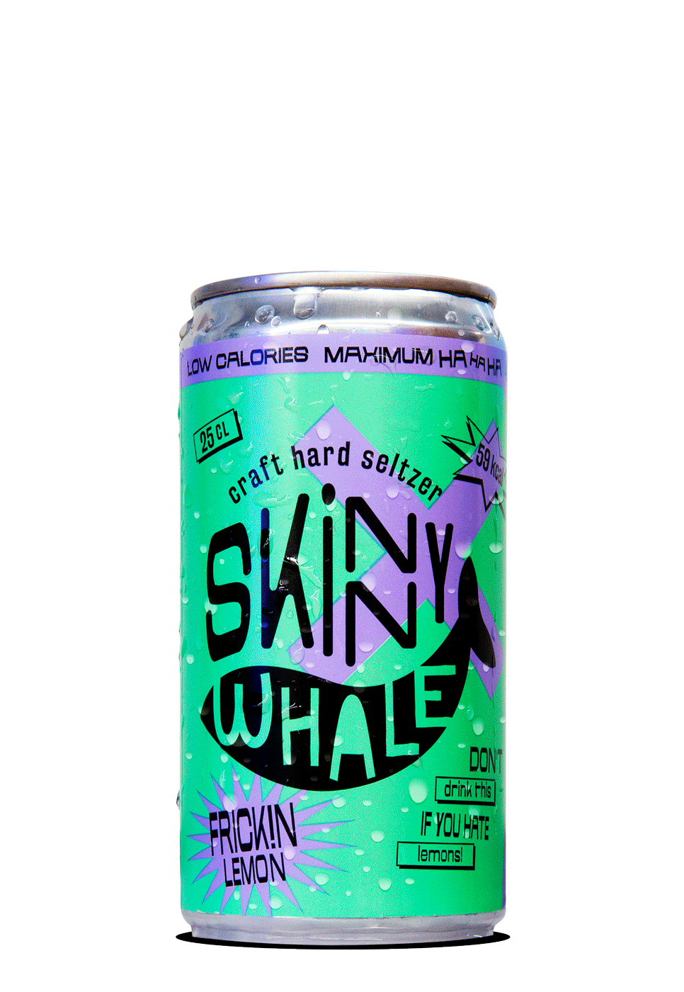
The whale word is protected in an organic shape, reminding us of a whale drawing or even a smile, giving the perfect match to Skinny Whale essence: LOW CALORIES • MAXIMUM HA HA HA
![]()
To bring a closer connection with the Adorkable Design of the brand, several whalemoji were created having the brand icon as a reference. Those characters will lead and conduct our target to dive into the absurdity absurd world from Skinny Whale.
![]()
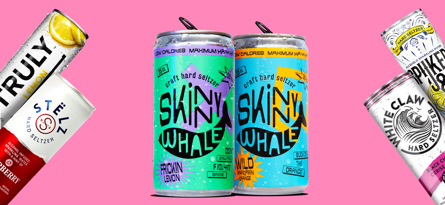
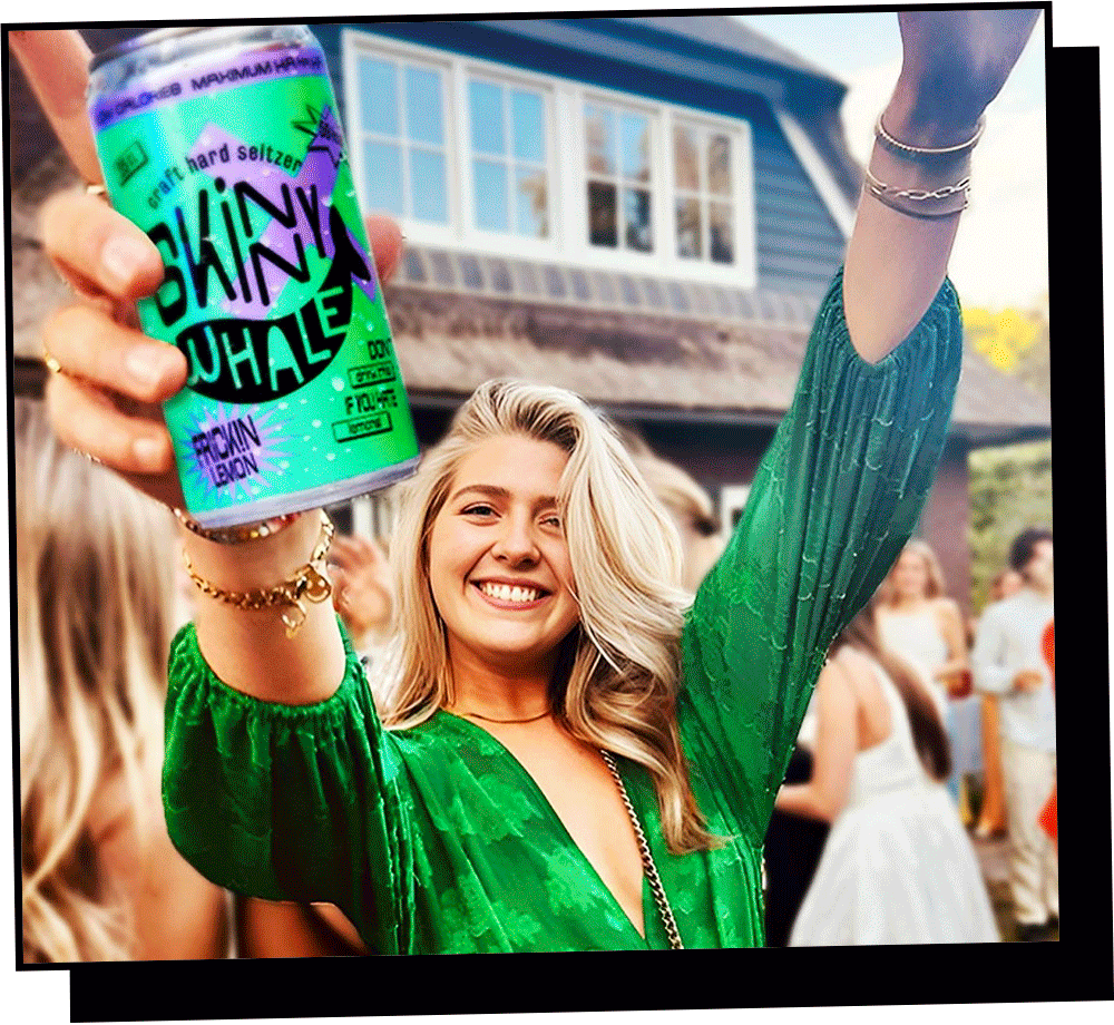
Skinny Whale stands out in everything it does. Its color palette is vibrant, solid and contagious. It has some "punky intergalactic" vibe that we love! The effect can be seen on the packaging, which goes in the opposite way from the competitors. Because in a world of sameness, we value individuality, self-expression, creativity and uniqueness.
![]()
![]()
![]()
![]()
![]()
![]()
Design Studio: Superheroes - Amsterdam - NL
Creative Director: Rogier Vijverberg
Senior Designer: Cris Faluba
Designer: Anita Csillag
![]()
![]()
![]()
The whale word is protected in an organic shape, reminding us of a whale drawing or even a smile, giving the perfect match to Skinny Whale essence: LOW CALORIES • MAXIMUM HA HA HA

To bring a closer connection with the Adorkable Design of the brand, several whalemoji were created having the brand icon as a reference. Those characters will lead and conduct our target to dive into the absurdity absurd world from Skinny Whale.
Skinny Whale stands out in everything it does. Its color palette is vibrant, solid and contagious. It has some "punky intergalactic" vibe that we love! The effect can be seen on the packaging, which goes in the opposite way from the competitors. Because in a world of sameness, we value individuality, self-expression, creativity and uniqueness.


Design Studio: Superheroes - Amsterdam - NL
Creative Director: Rogier Vijverberg
Senior Designer: Cris Faluba
Designer: Anita Csillag


